DataView picker — five views, one source
A shared view-picker design for ClassLink’s admin console uses the shape of a dataset to decide which browsing modes to offer.
- Status
- Archived design and implementation account. Matching source and a runnable picker demo were unavailable for the November 18, 2026 audit.
The documented Kanban rule
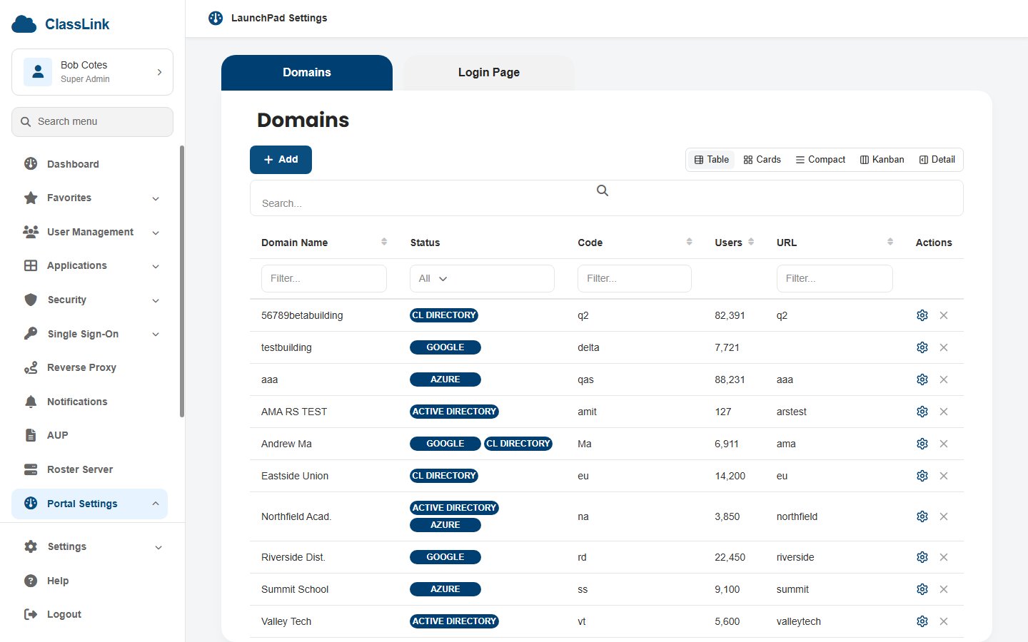
The implementation account describes a picker that checks column types before offering Kanban. The intended rule is to expose that mode when a status column is available.
| Example columns | Views the picker offers |
|---|---|
| Name, Status | Table, Cards, Compact, Kanban, Detail |
| Name, Code | Table, Cards, Compact, Detail |
These examples describe the recorded rule. The existing Domains screenshot illustrates the status-column case. The Name-and-Code case still needs a runnable fixture.
Problem
Every admin tool eventually grows a “view as…” menu. Table for power users. Cards for visual scanners. Compact for repeat operations. Kanban for status-driven work. Detail for the long read. Most teams ship one view, ship a second under feature pressure, then ship the picker as an afterthought — and the picker becomes a dropdown of options that don’t apply to the data the user is looking at.
I wanted to build the picker first, then build the views around it. The contract is: same columns in, five view modes out, and the picker tells you only the views your data actually supports.
Why the first consumer was Domains
The archived DataView plan starts with a concrete duplication problem. The Domains page maintained separate Table, Cards, and Compact layouts, plus a search and filter bar whose placement depended on the active view. The same pattern was expected to recur in other settings modules.
The plan chose Domains as the first consumer so the component could be tested against a real page’s status badges and row actions. It also kept the component inside the React shell initially. That app used shadcn, Tailwind, and Lucide, while the shared library used a different styling and icon stack. Promoting the component to the library was deferred until another app needed it.
The early proposal included a date-driven Calendar view. The case study’s later implementation describes Detail in that position. This distinction records how the scope evolved and keeps the planned views distinguishable from the demonstrated ones.
Archived implementation account and rationale
The sections below preserve the earlier implementation description. Current source inspection and runtime checks remain open. The archived plan specifies consumer overrides and Calendar, while this later account describes a narrower inference hook and Detail. The current API needs checking before treating either account as authoritative.
Approach
The system lives in cmc-module-reactsh (ClassLink Management Console — the React shell) at
src/components/data-view/. Five view implementations sit beside a shared <ViewSwitcher>
and a small inference hook.
The five views:
- Table —
@tanstack/react-tablepowered. Sortable, filterable, paginated. The default for any data that arrives. - Cards — visual grid. Activates only if the column shape has ≥2 columns worth of signal — otherwise it’s just a sparse list with extra padding.
- Compact — dense rows, no chrome. For users who already know what they’re looking at.
- Kanban — column-per-status. Activates only if a
statuscolumn is detected. No status column, no kanban — the picker hides the option, doesn’t disable it. - Detail — single-record long form. Always available.
The ViewSwitcher renders five toggle buttons with lucide-react icons (TableProperties,
LayoutGrid, AlignJustify, Columns3, PanelRightOpen). Active state is a single .bg-muted
class; the rest is restraint.
// useAvailableViews.ts (paraphrased)
export function useAvailableViews(columns: DataViewColumn[]): DataViewType[] {
  const views: DataViewType[] = ['table', 'compact', 'detail'];
  if (columns.length >= 2) views.push('cards');
  if (columns.some(c => c.kind === 'status')) views.push('kanban');
  return views;
}
This paraphrased hook illustrates the recorded status-column rule. The full API and consumer overrides remain to verify against source.
What this is actually solving
The defensive answer is “user choice.” The honest answer is users don’t want a choice they can’t act on. A kanban toggle on a dataset without a status column isn’t a choice — it’s a trap. The first click reveals the kanban view is empty, the second click reverts to table, and the user trusts the picker a little less for the rest of the session.
Hiding incompatible views isn’t a constraint. It’s the picker telling you what your data actually is.
Architectural choices that matter
- One
DataViewColumntype drives all five views. Columns declare akind(text|number|status); the views read the kind, not a per-view config object. Adding a sixth view doesn’t require touching column declarations. - Pagination is per-view, not global. Cards and Compact share a
<PaginationFooter>; Table delegates to TanStack’s own paginator; Kanban and Detail don’t paginate. The picker doesn’t pretend pagination is one concept. - shadcn/ui primitives (Button, Dialog, Separator) for chrome. The Table itself is wrapped
by
@erreib/cl-protoapp-components-reactso the samesearchable/sortable/filterableprops apply across the rest of the app.
What I’d do differently
useAvailableViewsshould return reasons. Right now it returns the list. A debug mode that returned{ view, available, reason }triplets would help when a user asks “why can’t I see kanban?”- The ViewSwitcher should remember per-collection. It currently keeps state per page. If I’m on the Users dataset and pick Cards, then Users → Detail → Users should land me back on Cards, not Table.
- Kanban needs ordering. Status columns are unordered enums today; designers ship the
column order and engineers infer it. A small
orderannotation on the kind would let the view render columns left-to-right deterministically. - No empty-state pass yet. Each view falls back to “no rows” generically. Cards and Kanban especially deserve illustrated empty states with the right call-to-action per collection.
Additional project context from the archive
DataView — multi-format viewer for tabular data, archived implementation plan. Establishes the duplication problem, first consumer, app-level scope, and original detection rules. Calendar appears in that proposal. The implementation account above describes Detail. Cross-app adoption and user outcomes remain unverified.
Verification update
The brain supplies an archived component plan and the portfolio contains a screenshot and implementation narrative. The matching React source and runnable DataView demo were unavailable in the accessible project folders on November 18, 2026.
View availability, search and filter continuity, default-view fallback, empty datasets, pagination, keyboard access, and adoption by other pages therefore remain unverified. A useful next fixture would switch between Name-and-Status and Name-and-Code datasets while retaining the same search.