domains-cmc-module — D+ → A- in seven passes
The admin console nobody enjoys, pushed from a D+ skeleton to an A- through seven /ux-review-loop passes — every grade, every pass, every dimension delta on file. This is the real arc behind the D→A claim on this site.
Open demo ↗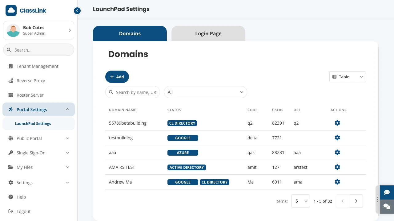
Problem
Before the first pass, a /critique run was blunt: “not AI slop, but not a confident design
either.” The console was a solid skeleton with width anxiety — everything stretched to fill
horizontal space in ways that hurt scannability. The specific sins:
- The status column was broken by design. It rendered all four integration badges (AD,
Google, Azure, CL Directory) for every row — active in blue, inactive in gray — at
min-width: 450px. Scanning 32 rows meant parsing 128 badge elements to answer one yes/no question per integration. Half the table’s width, 4× the necessary cognitive load. - Delete had no confirmation and equal visual weight to the gear icon — a red
✕on every row, pulling the eye toward the most destructive action with zero friction guarding it. - Search inputs had empty placeholders — both the table and the sidebar — so a first-time admin couldn’t tell what the search even covered.
- A six-section accordion opened with a confusing dual-gate (enable the toggle and separately expand the chevron) before you could change a logo.
- Inconsistent horizontal padding across toolbar / filter row / table meant controls didn’t align with the columns they governed.
It graded D+ (52). Competent bones, no confidence.
Why consistency mattered across modules
The April 30, 2026 CMC PRD describes district IT admins moving between identity and login, storage, portal management, SSO, rostering, and reverse proxy settings. Those tasks have different data, but the admin should be able to recognize how to edit, confirm, and recover across them.
The PRD establishes a common interaction vocabulary. Drawers hold edits and configuration, dialogs handle assignment, tabs organize profiles and subviews, and breadcrumbs preserve context. This provides the product rationale for the shared toast, confirmation, and validation work in the review loop. Each improvement can support several admin tasks.
The PRD identifies the repository as a frontend prototype driven by mock data, with backend integration still open. The review grades below describe evaluations of that interface. Task completion, reduced errors, and production adoption require separate evidence.
Approach
I ran it through /ux-review-loop — /ux-review scores the project, P0/P1 fixes get applied,
the build verifies, repeat. Seven passes. The discipline that made it work: build the shared
infrastructure first, so fixes propagated across all 14 pages instead of being re-solved per
screen.
| File created | Purpose |
|---|---|
toast.service.ts | Success/error feedback on every save |
confirm.service.ts | Confirm dialog with custom action label for destructive actions |
validation.service.ts | Rules engine — required, url, email, host, port, length, custom |
global-overlays.component.ts | Renders toast + confirm at the shell, Escape handler |
_responsive.scss | One breakpoint mixin, applied to all 14 pages |
The arc (the receipt)
Pass                Grade  Composite  Key changes
──────────────────────────────────────────────────────────────────────
1. Baseline         D+     52         Initial state
2. Shared infra     C-     63         Toast, confirm, 16px inputs, save buttons
3. Normalize/harden C+     70         81 token replacements, focus-visible
4. Responsive       C+     74.2       13 pages get breakpoints (14/14 responsive)
5. Touch + writing  B-     79         44px targets, fixed-width overflow, copy
6. Final B+ push    B+     87.3       semantic nav, ARIA, ~70 hex→token, validation
7. A- final push    A-     90.1       search labels, modal aria-label, panel tokens
──────────────────────────────────────────────────────────────────────
Total                      +38 pts over 5 grade levels
Dimension by dimension, first review → final:
Compliance (WCAG)   60%  → 94.5%   (+34.5 pp)
Usability           6.0  → 9.2     (+3.2)
Mobile Readiness    15%  → 89.5%   (+74.5 pp)
Design System       64%  → 93%     (+29 pp)
UX Writing          5.0  → 8.8     (+3.8)
Emotional Design    5.9  → 8.5     (+2.6)
Behavioral          32 violations → ~5
Dark patterns       0    → 0       (maintained)
The status column — the single worst finding — collapsed from 450px of ghost badges to a tight active-only column. Every save now toasts; every destructive action confirms; every input is 16px (iOS zoom prevention); focus is visible for keyboard users.
What’s still not an A
The honest part. A- is real, but it isn’t an A, and the report says where it falls short:
- Mobile Readiness 89.5% (B+) — tablet sidebar collapse and the hamburger drawer landed, but breakpoint coverage at the extremes (320px, ≥1440px) is still thin.
- UX Writing 8.8 (B+) and Emotional Design 8.5 (B+) — competent, not distinctive. The success states work; none of them delight.
Calling this “A-” instead of rounding up to “A” is the whole point of the scoring layer: the number only means something if it refuses to flatter.
Why this is the real D→A on this site
The homepage advertises a UX-score arc. This is it — a dense, real admin tool, not a
greenfield demo, moved 38 points with a pass-by-pass changelog anyone can audit. The arc is
only trustworthy because /ux-review’s composite is hard to game:
unresolved Critical findings cap the grade, dark patterns penalize it, and a regression alert
fires if any dimension slips. You can’t compose-average your way from 52 to 90.
The first pass tells you the console is a D+. The seventh tells you whether you actually fixed it. Without a stable, honest number across all seven, the climb is just a feeling.
What I’d do differently
- Publish the per-pass reports, not just the summary. The arc table is the headline; the
seven underlying
/ux-reviewreports are the proof. They should be linked, the way the receipts drawer links the comp-design-library run. - Close the mobile B+. The two thin breakpoints (320px, ≥1440px) are the cheapest points left on the board — an eighth pass scoped to mobile alone would likely crack A.
- The shared-infra layer deserves its own extraction.
toast/confirm/validation/_responsive.scsswere built here but belong in the design library so the next Angular prototype starts at C+, not D+. - Re-run after the Angular→React conversion. This A- is on the Angular original; the React port should be held to the same bar, with a visual-parity pass to confirm nothing regressed.
Additional project context from the archive
Domains CMC Module — Product Requirements Document, April 30, 2026. Describes the district-admin audience, shared interaction patterns, module scope, and frontend prototype constraints. It is a draft consolidated from the prototype. Its framework version and module grouping reflect that iteration.