comp-design-library
A standalone Angular 19 site documenting reusable tokens, palette, typography, and patterns for the prototype system.
Open demo ↗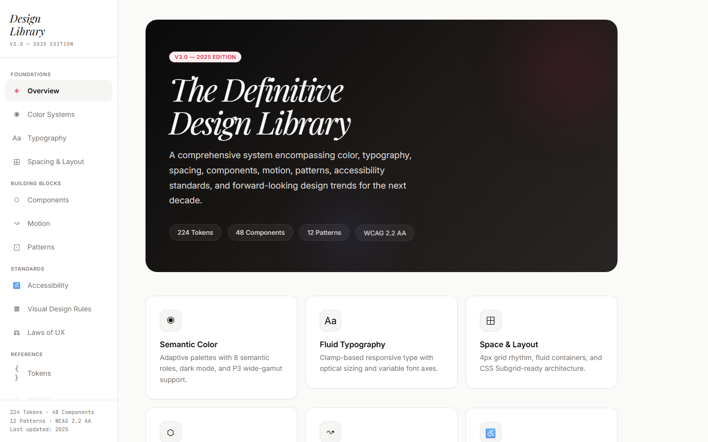
Problem
Every new prototype was relearning the same lessons: which --stone-* value reads on dark, how
tight the body line-height should be, when to reach for a display face versus a body face, what
counts as “warm” without sliding into beige. Figma was the source of truth in name only — the
truth lived in whatever I’d typed last week.
I needed a place where the system was the system, not a snapshot of one.
Approach
Built a single Angular 19 app with one job: render the design system, with every value
addressable in code. Tokens live as a typed TypeScript object (src/app/tokens.ts) so any
project can import { tokens } and consume the same colors, spacing, radii, and shadows.
The library is the artifact. There’s no separate npm package — the app is the documentation,
and the same tokens.ts gets copied into prototypes that need it.
What’s in it
- Color systems — stone neutrals + accent (deep blue) + five secondary tints (electric, teal, amber, emerald, sky), each with a “soft” variant
- Typography — display, body, and code faces with a 12-step scale from 10px to 72px
- Spacing — 14-step linear scale (0, 4, 8, 12, 16, 20, 24, 32, 40, 48, 64, 80, 96, 128)
- Components — 25 inline-styled Angular components across 15 sections, from buttons to full layout patterns
- Trends, Accessibility, UX laws — opinionated takes on what to copy and what to skip, refreshed when something changes my mind
What the library review exposed
An archived review of the Angular library found that the tokens were defined in a TypeScript object while the global stylesheet had no corresponding CSS custom-property declarations. The component examples still used local color and style values.
That finding sharpens the design-system problem. A central token file makes the vocabulary explicit, but consistent application also needs a path from those definitions into the rendered components. Otherwise the documentation and its own examples can drift apart.
The same review recorded examples of that drift in tag contrast and control semantics, including tabs without selected-state semantics and theme swatches without accessible names. These are historical findings for the reviewed version. Their resolution needs a fresh implementation check.
Why it earned its own case study
Because portfolios that hide their design system are missing the point. The library is the evidence that the rest of the work isn’t accidental — accent colors, spacing, and component rhythm are governed by reusable decisions rather than whatever felt right in the moment.
Tokens-as-code, not tokens-as-Figma. The decision to make TypeScript the source of truth was the single highest-leverage call in two years of design work.
What I’d do differently
- Bundle is 666 KB, 33% over the 500 KB Angular budget. Lazy-loading the 15 sections is the
obvious next step —
/optimizeis queued. - ~300 hardcoded literal hex values drifted in across components before I added the lint
guard.
/normalizeto clean. - No dark mode. Picked one canvas (chalk on stone) and committed. Adding dark would mean refactoring tokens to CSS variables — the right move, just not today.
- No interactive playground for components. You can read them, you can’t fiddle with props. Tier 3 backlog.
Additional project context from the archive
/ux-review — comp-design-library (Angular design library), archived read-only review. Records the TypeScript token definitions, missing global CSS variable declarations, and component-level accessibility findings. It establishes review history. Current fixes and adoption in other products remain unverified.