Widget Component Library — the substrate I haven't shipped yet
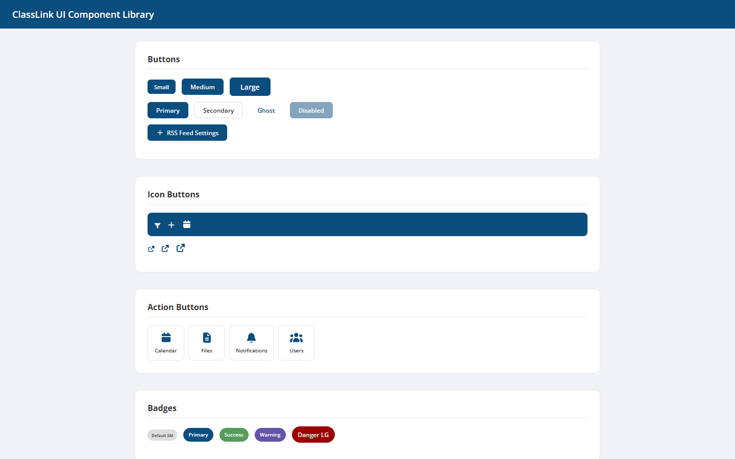
An Angular 21 component library with 26 dashboard primitives — stat cards, metric cards, chart widgets, feed items, status indicators. Packaged with ng-packagr, demoed in a sibling app, not yet consumed by anything else.
Problem
Every prototype I ship grows the same handful of components in slightly different shapes — a stat card here, a metric tile there, a feed item that’s almost the same shape as the one in three other apps. Each rebuild loses small bets the previous version had won (the right shadow, the right empty state, the right accessible name on a circular score).
The Widget Component Library is the bet that this stops. One Angular library, one demo app beside it, every primitive parameterized once and reused everywhere downstream.
Approach
Standard Angular monorepo with two projects:
projects/ui— the publishable library, built withng-packagr. 26 standalone components. No app shell, no routing, no opinions about state.projects/demo— sibling app that imports the library and exercises every component in isolation. Serves as both manual visual regression and live documentation.
The 26 components, alphabetized:
action-button, app-icon, app-list, badge, button, card, chart-widget,
circular-score, divider, empty-state, feed-item, file-item, grade-card,
icon-button, input, list-item, metric-card, modal, progress, search-input,
stat-card, stat-row, status-indicator, tab-button, toast, widget-container
Categories that emerge from this list:
- Indicators —
badge,circular-score,progress,status-indicator,stat-card,stat-row,metric-card,grade-card - Containers —
card,widget-container,modal,divider - List items —
app-list,feed-item,file-item,list-item - Inputs —
button,icon-button,action-button,tab-button,input,search-input - Surface —
app-icon,chart-widget,empty-state,toast
Roughly half are dashboard primitives (the things every metrics view rebuilds), a third are list-row primitives (the things every feed/files view rebuilds), and the rest are chrome. That’s the right balance for a K-12 product surface where most screens are some combination of dashboard and feed.
Why this is in the portfolio even though nothing consumes it yet
Because shipping a library is a different bet than shipping a feature, and the bet’s worth naming before the consumers exist.
The library is not yet referenced from cl-launchpad-protoapp-new, parentport-main,
or any of the my-files variants — I checked. The package.json has private: true and no
main/module/exports field set for external publication. It’s a working library, not
a published one.
That gap is the case study. Most “design systems” die in this gap — the components work, the demo app works, and then the consumer integration never happens because the library was built without a specific first consumer in mind. I’m naming the gap so I can close it.
A component library without a consumer is a folder. A component library with one consumer is a habit. Two consumers is a system.
What I’d do differently / what’s next
- Pick the first consumer. The launchpad’s dashboard widgets row is the obvious target — stat-card, metric-card, and chart-widget all map to what’s already there. One PR to wire the library in, keep the existing components as fallback, ship behind a flag.
- Version control it. The directory isn’t a git repo. Until it is, every change is lossy. This is the embarrassing first todo and it’s the first todo for a reason.
- Storybook over the demo app. The demo app exercises components but doesn’t isolate them. Storybook would force per-component stories, controls for every input, and a visual diff workflow.
- Publish to the private @classlink/ registry. The library is currently consumed only via path import. Publishing it makes the version contract explicit and gives consumers a real upgrade decision instead of a silent path resolution.
- Audit against the design library tokens. The widget library should reference
tokens.tsfromcomp-design-library, not maintain its own SCSS variables. One source of truth. Today there are two.